Top 5 Web Design Trends Right Now
Design trends often reflect pop culture and recent important developments for various audiences. This has been true throughout the years in advertising and marketing, with web design more important than ever in this modern age where the internet is at the tip of your fingers. Here are five web design trends that are popular right now and could breathe new life into your website.
Scrollytelling
All good websites should have a narrative, whether it be a simple navigation bar on each page or something more complex.
Responsive and parallax websites have been a mainstay in website design for a good few years but one of the upcoming favoured trends is a website where the navigation is dictated by the scroll system, with users being able to see the ‘story’ of the website at their own pace. This is similar to a another trend which is side-scrolling websites rather than the portrait scrolling which has become the standard.


Typefaces being as brands
Legibility is one of the main factors in the choice of typeface used by a business or a brand. Whether it be Coca Cola or Pico Font for Twitter, the typefaces used by a brand become as synonymous as the logo mark itself. Because of this the web font needs to be representative of the brand and company. This poses a challenge as some fonts inherently do not work as well or they are not as legible so these are considerations to think of.
Five examples of common effective serif web fonts are:
- Nexa
- Lato
- Montserrat
- Neue Helvetica
- Roboto
And here are five examples of common effective sans serif web fonts:
- Lora
- Merriweather
- Spectral
- Times New Roman
- PT Serif
Use of Emojis
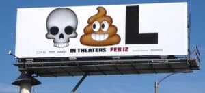
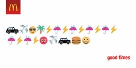
Since the early internet days of chat blogs and forms of instant messaging there has been the rise of the emoji. From the love heart to the smiley face these symbols are universally recognised in marketing and are often more effective than calls to action or slogans as they are more visual and keep the consumer’s attention.
Often less is more and something simple can be effective at sticking in consumer’s minds, such as the advertising for Deadpool which featured two emojis and a letter:
Colour
Colour in web design is important as the canvas isn’t a static one. Web design has the affordability of being able to transition between colours in a way other mediums cannot.
Colour is arguably the most important aspect in web design. Whether it be two colours or a campaign which is spread across the whole spectrum, it is important to note what colour to use within your designs. Below are some of the 2022 colour trends:
Pastel Gradients
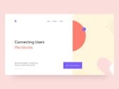
Gradients have always been prevalent in design and one of the current trends is the use of pastel gradients in design. The current trend is the use of muted gradients which can mainly operate as background colouring to bring out what could be featured in the foreground.
Primary Colours
As well as brand set colours, primary colours are used as a stable base either in contrast or complement to the call to action which will be the main focus of the advertisement. Within the companies and brands there will most often be a primary colour used as well.
Negative Space
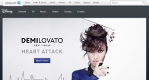
When looking at trends, negative space has always been prevalent in design. Often it is not what is shown but what isn’t shown that is the stronger message and can draw the consumer’s eyes. Having the platform of a website negative space can be used in a fluid motion whether it be through motion graphics or throughout the website and page designs.
We hope this gives you some ideas for your next website overhaul. If you would like any help with your web design project, get in touch.
